Sunday, 30 December 2012
Final Cut X – Apple's Black Sheep
This is just a short account of my recent experience with Final Cut X. Having used Final Cut over the last few years (only recently converting to Premiere), I was looking forward to use their latest installment in editing software: Final Cut X. Upon opening the program, my initial surprise came from the difference in the appearance of the console. There were rumours before it came out that Apple was moving away from professional editing and towards the consumer sector. This was evident within a few minutes of using Final Cut X, which began to feel more like a glorified iMovie than a professional editing package. The simplest of tasks that are the work of a second in Premiere are either missing, require plugins that have not been released or require a convoluted process using a host of other software. Editing titles, image control, colour mattes...WHERE ARE THEY??? The most annoying aspect for me was the inability to create save files, making the project to appear in your movies folder, and forcing you to follow an overly complicated procedure if you want to share a project on two computers. Other letdowns are the backwards compatibility issue, the limited export options and the lack of audio control. This is the most disappointing technological release that I can remember and I have immediately switched back to Premiere and After Effects.
Wednesday, 11 April 2012
Bloomin marvelous
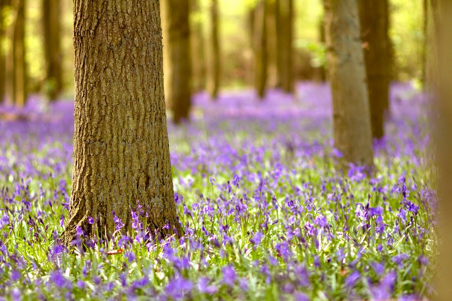
For all you budding landscape photographers out there, it's that time of year again when the bluebells are rampant in our woodlands. It's well worth searching for a good patch near you and spending a little time to find an interesting angle to show them off. Personally, I like using a higher focal length because you really get a sense of the total coverage of their blanket and get a full blast of colour. The image below was taken in Knott Woods near Rothamsted Park, which is only open to the public for this month. While there is probably better light in the early morning, as long as you get some nice shafts of light to illuminate them, there is no reason why you cannot get a great image at midday.

Taking a picture to print: PART II – colour
It may sound silly, but when working with colour images, one of the most important things is to get the colour spot on. Nobody wants to end up with an image showing purple grass or yellow trees (with the possible exception of D.Hockney). There are different processes (both in camera and in post-production) that can have a dramatic influence on the colour of your final print/image and while it may not be in your interest to learn and understand all the related technical jargon, it's fundamental to know how they affect your image and how to control this.
In Camera
For almost all photography, the trick to creating great images is making sure that you've made each step along the way as easy and quick for yourself as possible, starting in the camera. Even before pressing the shutter, you should have gone through the menu and set the camera up for the type of shooting you want. This includes controls for choosing between jpg/RAW, metering modes and importantly, colour space and white balance.
Colour spaces are models that are used to represent colour using quantifiable values of Red, Blue and Green. There are two colour spaces available in the camera: Adobe RGB and sRGB. If you wish to know more about these, then there are some very in depth blogs and websites that will go into much greater detail. In the interest of time, here is a brief overview. The 'S' in sRGB stands for standard and as such, it has become the standard colour space for image display. Adobe RGB was designed to encompass a broader range of colours, aiming for most of those achievable on CMYK printers. So Adobe RGB has more colours, sRGB can represent finer shades of colours. This is about all you need to know. Almost all photography work is done using sRGB because it is universal and compatible around the world. Unless you have some special need for it, are controlling all post-production and are in direct contact with your printers, Adobe RGB is not for you.
Now you have your colour space sorted, it's time to correct your white balance (WB). In order to achieve the most accurate representation of the real world colours, you need to work out what the primary source of light is and it's temperature (temperature is just another word for colour –hot being redder and cold being blue). There are different types of lighting, but the three most common are tungsten (red-orange), fluorescent (blue) and daylight. To make your job easier, try not to mix different temperatures of light or you will find it very hard to balance the colour of all the elements in the image. In the event that you require another source as a fill light, try a flashgun with a complementing coloured gel. On some DSLR's, it is also possible to set your own custom white balance, and for this, you need a white surface to act as a reference colour. Generally, I just shoot on auto WB and make any small adjustments in Photoshop. In some instances, when I find that auto just isn't having the required effect, I might change it to one of the presets, but it is rare for me to need a custom WB.
Post-production
Assuming that you've been shooting in RAW/sRGB and have kept to good shooting practice, your photos should need minimal adjustments. I try to keep mine down to adjusting levels, colour balance, contrast and possibly adding a vignette. Exceptions to this include exposure comps, long exposures and HDR shots.
You may be patting yourself on the back now, thinking that you have negotiated your way through all the hurdles that have been flung in your way, but in fact there is one final test to champion. This is the part of the process when you need to work out what final output you are looking to produce and it's destination. You may want to upload your photos to a photo sharing website like flickr or 500px and have them scrutinised by your friends, enemies and total strangers. Alternatively, you may want to print them out and post them in a scrapbook or up on display for everyone to see as they walk into your room. Once you do this, you will be able to decide whether you want to export your images as CMYK or RGB.
CMYK and RGB are both colour spaces that are used to represent images in various formats. CMYK is the colour space used in printing and stands for: Cyan, Magenta, Yellow and Black. These colours are related to the process by which colour is laid down in printing. If you have the chance, try looking at a photo in a book or a magazine with a magnifying glass and you will see that it is made up of loads of little coloured dots (some colours/text may not be made up of dots, but a constant layer of colour, but these use a process called spot colours, which cost a lot more and are not appropriate for printing photos). RGB stands for...you guessed it: Red, Blue and Green. Initially, RGB was initially created to closely resemble the colour perception of the human eye, but now it is used as the standard colour space for all electronic devices, including web.
When sending images to print, always make sure your images are CMYK and 300 dpi (dots per inch – located under Image Size in Photoshop – consider whether you want to resample image, as this will change the number of pixels in the image and will affect the file size considerably). As I said in my previous post, try to export in jpg, as this will reduce file size and cause less confusion when sharing.
When editing on the computer and uploading images to the web, make sure your images are RGB and 72 dpi.
Friday, 6 April 2012
Taking a picture to print: PART I – jpg vs RAW
sRGB or Adobe, CMKY or RGB, what is DPI? Before and after the shutter has been released, a photographer is presented with a vast number of options that affect both the picture quality and appearance. It would be an easy thing to flick the camera to Automatic mode and happily snap away in the knowledge that the camera is doing all the thinking for you. But if you are interested in taking your photography to the next level and want to compose pictures or bring them to print, a degree of understanding is needed to prevent mistakes that could have otherwise been easily avoided.
First let us consider the debate of jpg vs RAW file. A few years ago, I was lucky enough to spend a couple of weeks deep in the Honduras jungle, conducting field experiments. At the time I was only a casual photographer and so only had a few small sized SD cards handy, with no laptop or portable hard-drive. In this scenario, I decided to use jpg instead of RAW, because it enabled me to continue shooting all the way up to the end of the two weeks without running out of space on my cards. The low file size of the jpg is one of the major advantages that the jpg has over RAW files. A typical jpg can be around a 1-3 MB, where a RAW can be 2 or 3 times larger than this. There are various technical reasons for this, but the only one you really need to know about is that the RAW file captures all the information from the sensor (including a higher dynamic range), while jpg doesn't, which is where the strength of shooting in RAW really lies.
I always shoot RAW these days, not only for its ability to capture all the information on the sensor, but largely because it is a loss-less format, meaning that I can edit my photos to my hearts content and the image will maintain its quality, where a jpg will deteriorate with every edit you make. This even includes making minor changes, like a quick contrast change or rotation.
You may be reading this and thinking that RAW is definitely the choice for you and largely, I would agree that it's the format of choice, however, there are some minor drawbacks. For instance, because of all the information it takes in, it takes longer for the camera to record a RAW shot than jpg. For landscape photography, this may not be a problem, but if you are an action or sports photographer, you might want to factor this in your decision. Another problem that I have encountered on various occasions is the issue regarding compatibility with computers. All the different brands of cameras have their own RAW files and certain editing software have notoriously had problems in opening some of these. Recently, I tried opening a few Nikon NEF files in Photoshop CS5 and encountered errors. While this is easily solved with download-able plugins or updating software, it renders RAW files unsuitable for sharing with other people, who may not have the correct version of software to open it. If you don't own any editing software or have no intention of editing, then jpg is for you since it is a universal file that can be opened in most software. It is also sharper and has a higher contrast than RAW files, which can look slightly washed out without appropriate tweaks.
So to conclude, in almost all cases, it is better to shoot RAW, as you will have a greater control over the final image and safeguard against any mistakes in the camera (eg. a quick colour balance in Photoshop to remedy a dodgy white balance). After all the editing is complete, the final image should be saved down as a jpg, which is an ideal file for end users and clients due to its compatibility and relative small size. If you are still having difficulty in choosing between the two, I recommend you find the setting on your camera that allows you to shoot both jpg + RAW, since this will allow you use the jpg photos immediately and should you wish, come back to the RAW files in the future for post production.
Friday, 23 March 2012
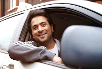
Roadio photoshoot
Have been working with Roadio in the last few weeks, creating some hero shots for their website as well as profile pics for each driving instructor. I used my Canon 7D with 100mm f2 as well as a Nikon D7000 with a Sigma 18-50mm f2.8 macro (with on camera flash for fill). Had to Photoshop some blue skies in, as it was miserably overcast.


Business Card Designs


Subscribe to:
Posts (Atom)